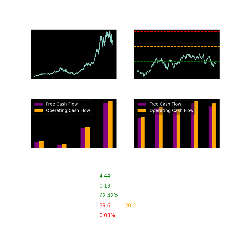
Image Description
The above image is an example of how the stocks are displayed. Let's go over all it's components.
Graph: 5 years
Shows the price of the stock in the past 5 years. Sometimes it displays "Since Start" which means that the 5y period couldn't be fetched.
Graph: 1 year
Shows the price of the stock in the past year. Sometimes it displays "Since Start" which means that the 1y period couldn't be fetched.
It also has 3 horizontal lines. These lines show analyst price targets (how much the stock should be worth).
- Green - Lowest price target
- Yellow - Average price target
- Red - Highest price target
Graphs: Cash Flow
Shows the Free Cash Flow and Operating Cash Flow of the company in past years.
The Quarterly Cashflow graph just shows values over quarters, which can provide more recent financial events.
Solvency
Measures whether a company has enough assets to cover its liabilities. It is calculated as Current Assets / Current Liabilities. Any number above 1 means that the company is financially stable.
Debt to Equity
Measures how much a company is borrowing compared to what its owners have invested. It is calculated as Total Debt / Stockholders' Equity. Any number above 2 is a bad sign indicating high dependence on debt and potential financial risk.
Income Statement
Company's efficency in generating profit. It is calculated as Operating Income / Total Revenue. The average is 10% and anything above is generally good.
P/E (Price-to-Earnings)
Measures how expensive a stock is relative to its earnings. A lower number suggests the stock may be undervalued, while a higher number can indicate overvaluation or strong growth expectations.
- TTM P/E (Trailing Twelve Months P/E) - Current Stock Price / TTM Earnings per Share
- FWD P/E (Forward P/E) - Current Stock Price / Estimated Future Earnings per Share (this is just a prediction and should be taken with a grain of salt)
Dividend Yield
How much the company pays in divdends compared to stock price.
Industry
Shows the industry the company is in.
🚨Disclaimer🚨
This website only shows undervalued stocks that may be worth investing in. Always do your own research before investing.